Coursework
Wednesday 3rd May 2023
Coursework:
L/O - To explore possible tasks & research similar products.
Website -
Create a homepage and one linked web page for a health and fitness website targeted at an audience primarily of 14 - 18 year olds.


Wednesday 10th May 2023
Research:
L/O - To research codes & conventions of similar products

1) They include fitness techniques, what workouts are best for teens, why exercise is good for you, symptoms of compulsive exercise, a search bar to find health centres near you (input your zip code/city).
2) People walking their dogs, people having fun working out.
3) They use quite vibrant colours like orange, blue & green
4) The logo is quite big and is in the top left, it uses a cute font and has little bubbles trailing of it, I'm not sure how it links.
5) There are 6 pages and they are, Sex, pregnancy & STDS, relationships, health & wellness, LGBTQ+, For adults & news & resources.
6) Things to help you lose weight and about eating disorders.
7) The logo is in bold and quite a cute font, all the information is in a small sized font and is a normal font (probably easier to read), all the titles are a large sized text and also a basic font.
8) They all have the logo in the top left of each page, they all stick to the same colour scheme, the logo also has its own animation for each page (it takes a few seconds to fade in each time),
9) All the linked pages are at the top right of the screen they all have a normal font
10) They typically use 1 - 2 images in their linked pages, they tend to use it as a background image for some text (see below for example)
11) On the text for the background image its quite big and in bold to tell you what this page will be talking about
12) Its organised in paragraphs with large titles at the top, more links to other pages to help with certain issues (relationship troubles, mental health, eating disorders, etc).


Wednesday 7th June 2023

1) Website conventions are patterns that will help people navigate websites.
2) The homepage is the screen you are greeted with when you click on the website and the linked pages are pages that you click on and it takes you to a completely different website, the websites are linked because the linked page is linked to the homepage so you can only access the linked page if you are on the homepage.
3) They discuss exams and how to deal with stress during exam season, which is linking to the target audience as the website is for teens specifically.
4) The logo is a plain black background with white text emblazoning 'Health For Teens', the website does not have a slogan as far as I can tell, the colour scheme is black, purple, pink and a cyan colour. The colour scheme and logo link to each other as the logo is the same colour as the background for the home screen
5) For their logo they used quite a large sized sans serif font, for pretty much everything they all have a sans serif font. For the linked pages they have a smaller sans serif font.
6) The target audience is teenagers so roughly 14 - 18 year olds. It appeals to them as on their homepage they talk about exam stress, mental health and more things that teens are likely to struggle or need help with.
7) The images mainly show people studying, relaxing and more.
8) The videos talk about stress and mental health, and talking about how to keep yourself healthy during exam season.
Website 2
1) Website conventions are patterns that will help people navigate websites.
2) The homepage is the first screen you see when you click on a website whereas a linked page is somewhere you are able to get to from the homepage.
3) They show you hiking bags, yoga routines, workouts and more. This links to the target audience as the target audience is all adults and adults want to know where to go to do yoga, etc.
4) The logo is the words 'very well fit' and the word 'fit' is in a yellow box, the slogan is 'Know more, be healthier' The colour scheme is mainly white and yellow with black text which is themed off the logo as the logo is exactly those colours.
5) For the logo its also a large sans serif font and all the little text boxes around are also in sans serif, the large titles for the text boxes are all in bold whereas the text underneath is not in bold.
6) The target audience is adults so probably around 20 - 30 year olds. It appeals to them as it talks about doing yoga and hiking etc.
7) The images show people working out and pictures of hiking bags and doing yoga.
8) There are no videos.
Codes & Conventions I will
use for my Website:

1) The style for mine will be a sage green theme with pretty icons around
2) I will use cute fonts and will make it appealing to the target audience.
3) I will use images of food and people working out (mainly teenagers) and I will put easy foods that teens can make at home.
4) My logo will have a sage green background with a white text with little bubbles/another icon trailing off of it.
5) My homepage will have multiple linked pages and have information for teenagers to access about mental health, eating disorders etc.
6) My linked pages will be about Sex and Relationships, mental health etc.
7) My colour pallet will be mainly sage green and white but some other colours too.
8) My linked pages will be mental health, sex & relationships etc.
Wednesday 14th June 2023

1) Healthy Teens, Healthy Minds
2) The aim of it is to interest girls in fitness and eating healthy tasty treats
3)
4)
5) Images of healthy food, pictures of teens that are in shape.
5) Images of healthy food, pictures of teens that are in shape.
6)
7) I will add linked pages on periods, sex and relationships and healthy eating
8)
9) The video will show a video on mental health
10) My target audience is female teenagers so I will use cute colours like sage green and white to appeal to their minimalist style.
11)
12)
Wednesday 21st June 2023
Adobe Illustrator
L/O - Explore the use of Adobe illustrator to create a magazine masthead or logo

Wednesday 28th June 2023
Target Audience
L/O - To research our target audience to enable successful targeting.

Cover One:
- Target audience probably men because of the colour pallet
- Probably aimed at older people
- A person who wants to become a CEO or rich
- Someone who is interested in business.
Cover Two:
- Probably aimed at women
- Aimed at older women
- Aimed at a woman who wants to have a better body
- Could be aimed at men because of the attractive woman on the front.
- Cover lines indicate it could be aimed at men and women.
Cover Three:
- I think the target audience is men because its got Daniel Craig on the cover
- Age range possibly 30 - 50.
- He is dressed in casual-smart clothes
- Potentially wealthy people? Class?
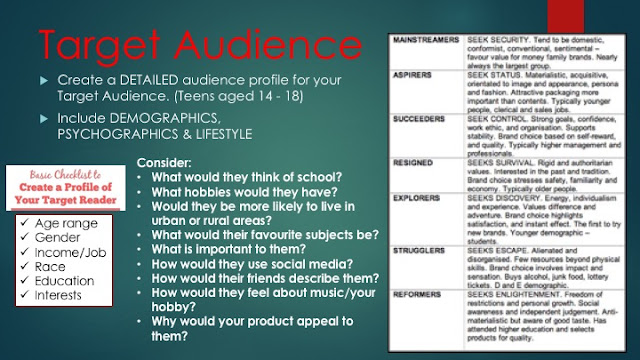
Fact File: Spirit Springs
Age: 16
Gender: Female
Income/Job: Works part time
Race: White
Education: In school Year 11
Interests: Interested in fitness and working out, she would love baking and preparing healthy treats for her and her friends.
Interests: Interested in fitness and working out, she would love baking and preparing healthy treats for her and her friends.
1) She loves school and studies really hard to go to her dream University
2) She likes to sew and bake treats
3)
4) Her favourite subjects are PE, catering and dance
5) Going out on runs every morning is important to her and making healthy treats
6) She doesn't like to use social media very often but has many social apps, mainly for talking to her friends.
7) Their friends would describe her as competitive, athletic and friendly.
8) She would love music and would listen to it when running and walking to school
9) She would like my website because it would give her healthy recipes and tips on how to workout efficiently.
Wednesday 12th July 2023

Wednesday 13th September 2023
Coursework Review:
L/O - To recap brief criteria and
to explore how to create
effective representations.


- My website will follow the layout of having lots of linked pages at the top of the screen, it will have some pictures and images of healthy foods and workout routines that are easy for teens to follow. The linked pages will be named, Healthy Snacks (My main linked page), Easy workouts, healthy living and eating properly/ eating disorders.
- My linked page will be about healthy snacks/dinners that you can make at home. It will also include a video on how to make a healthy snack that is easy to make.
- The genre of my website will be clear with all the pictures of my workouts, healthy snacks.
To Do List:
1) Actually create the website (and linked page)
2) Start writing the article for homepage
3) Take a video about mental health
4) Take pictures of healthy foods (strawberry clusters, salads etc.)
5) Get pictures off Pinterest of workout routines for teens
Wednesday 27th September 2023
Do Now: Section Headers -
1. Workouts
2. Food
3. Good Shops for workout gear
4.
5.
Wednesday 4th October 2023

Wednesday 1st November 2023
Do Now:
1) Interview
2) Recipes
3) How to
4) Reviews
5) Step By Step guide
6) Profile
7) Fact Sheet
Article Writing:
L/O - To create a convincing article for a teen
health and fitness website using
appropriate language, tone & representation.
- Information
- Images
- Sub-headings
- Links
- Recipes

1)
2) The article will be about mental health and how it affects teenagers
3) The images will be on my main page and they will be of weights and other equipment you can use for working out
4) There won't be instructions on how to do something
5)
6) I will have the same font for my titles as on the main page
7) The name of the website will not be on all the pages
8) There will be numerous sub-headings such as; who to talk too when you feel like that, how to deal with mental health etc.
9) There will be no people in there, except for me in the video
Things I want to say in my article:
Talk about how mental health affects teens
Talk about how many teens suffer with it
Talk about suicide prevention month
How social media affects mental health


RESEARCH:
ReplyDeleteGood research into conventions and strong analysis
TA PROFILE:
I like this - well done!
PLANNING:
A good start - which logo design are you using?
I'd like to see more about how you're going to target teens.